Thermidor
- Proposition
- A Riviera beach club, cut like streetwear
- Client
- Self-initiated
- Year
- 2026
- Discipline
- Web, Graphic
- Role
- Identity, Art Direction, Web Design, Development
- Site
- Live preview
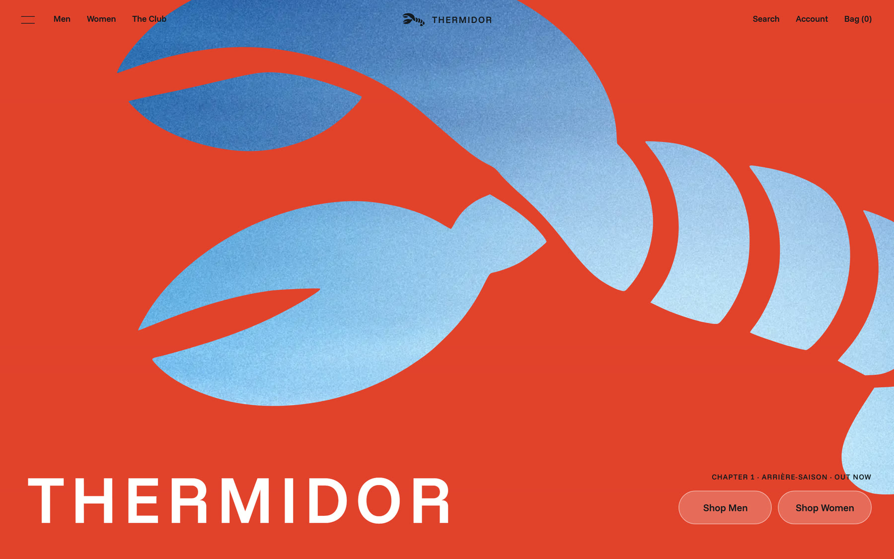
Thermidor is a Riviera sportswear label - 1960s club cuts worn boxier and a little louder. It is also mine: a self-initiated brand, not a commission, built end to end as the studio's own. Identity, art direction, the storefront and the motion, first drop SS27.
The world is one place: a beach club at lunch. Cabana stripes, a parasol, a hazy sky, a lobster on the menu. The rule everything else had to pass was that it come out of that club and never look like a costume of it - which is the line between a brand with a world and a brand with a theme.
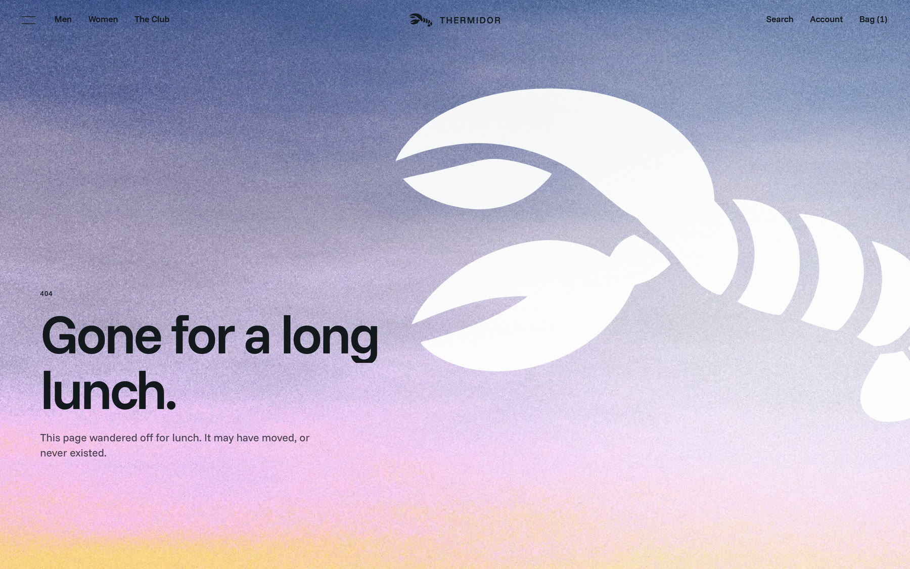
Lobster Thermidor is the stiffest plate on a Riviera menu, and Thermidor is also the name of high summer. The label is the lobster that decided it was done being dinner, walked out past the waiters, and stayed on the beach.

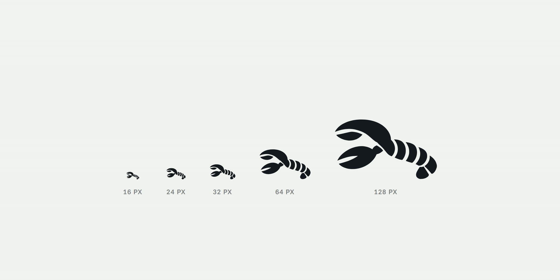
The mark was drawn by hand, traced to vector, then redrawn where tracing stops helping. The constraint that shaped it was physical rather than visual: it has to survive being embroidered onto a 2.5 cm chest crest. At that size the narrowest gap in the artwork is 0.8 mm, which is about where a needle gives up, so the tail segments were rebuilt as bold cabana bands and every gap was widened until the shape still read in thread.
Six colours, specified in OKLCH so the steps between them are even to the eye rather than even in hex. White and ink carry about 85% of every screen and the brand colours are held back for the moments that are actually brand moments - which is the only reason they land when they arrive.
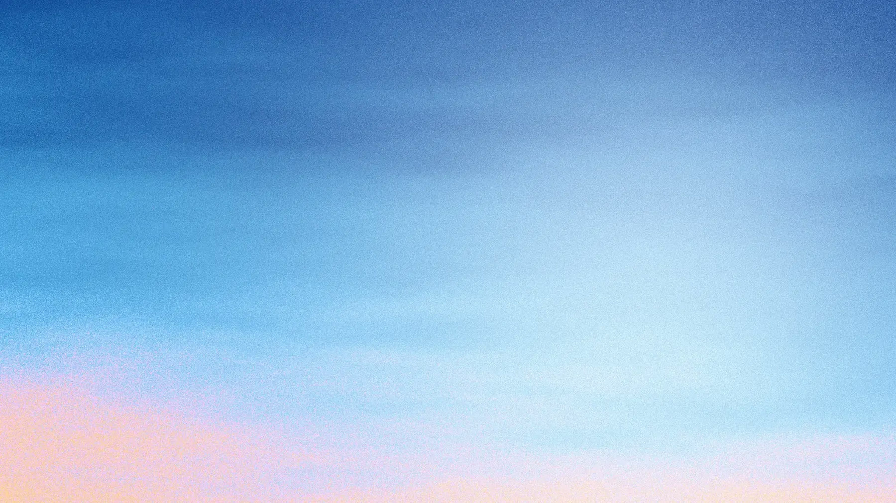
The sky is a shader, not a gradient: colour stops that warm towards the horizon, wind-stretched haze, and a stippled grain that doubles as the dither. It changes with the season and runs from afternoon to dusk as you move through the site. The grain appears on exactly two surfaces in the whole project, which is what keeps it a signature instead of a texture.
Nothing moves by default. Every curve was tuned and then collapsed into three tokens used across the entire site - arrive, glide, leave - with leave running at 0.6 of arrive, because leaving should always be quicker than coming. The menu's hover is on springs rather than tweens: the hovered tile grows, every other tile shrinks by the same amount, and a fast swipe re-aims the springs instead of restarting them, so the row never stutters under a moving pointer.
The storefront is the brand board running. Every page maps to a tile on it: the shop grid broken by an editorial stripe frame, a pinned category list whose sky cross-fades as you scroll, a product page with the reassurance placed where hesitation actually happens, and the bag as a drawer over whatever you were looking at rather than a page you get sent to.
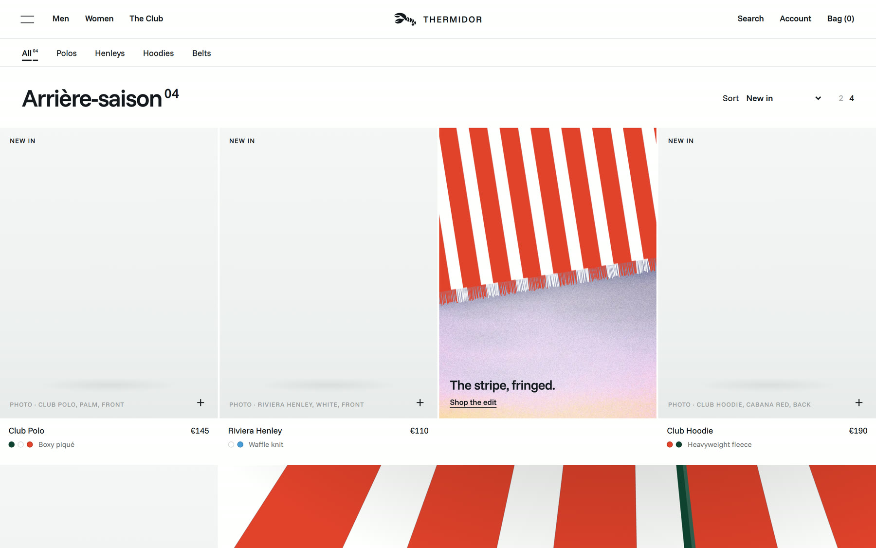
The product frames are empty on purpose. Thermidor has no garments yet, and dropping stock photography of somebody else's polo into the grid would have made the one part of the project that is genuinely unfinished look finished - and quietly turned the rest of it into a question. So each frame states what belongs in it and the layout is judged on the layout. The system is what is being shown here; the clothes are a separate job.
It is built headless on Shopify Hydrogen, so checkout, stock and accounts stay on Shopify where they belong and every pixel in front of them is custom. The type is Funnel Sans: the board was set in a commercial grotesk, and rather than buy the licence for a label that has not shipped, 45 free faces were rendered and scored by glyph overlap against it. Funnel Sans came out at 0.78 - close enough that the voice survived the swap.
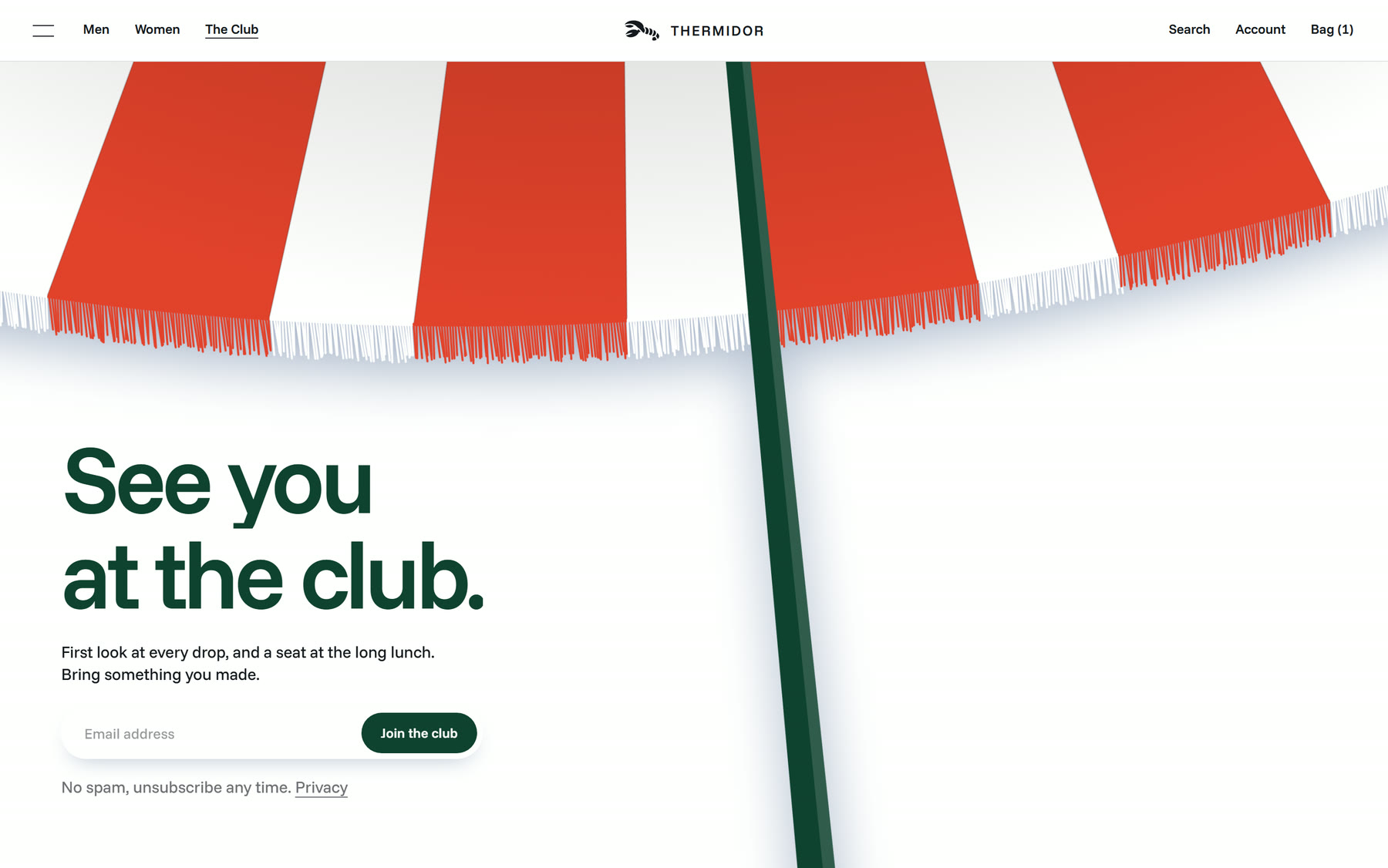
Built to the standard the brand implies: AA contrast on every page checked with axe, which is why small type on cabana red is set in ink and not in white. Keyboard and screen-reader paths through the menu and the bag, with dialog roles, a focus trap, Escape, and focus handed back where it came from. Reduced-motion visitors get the same site with fades instead of movement. The sky compressed from 5.4 MB to 2.0 MB with no visible change, and the grain runs as a 12 fps overlay rather than per-frame.